The Top 10 Web Design Best Practices & Trends For 2020
Create An Amazing Web Experience For Your Visitors With These Smart Website Strategies!
Updated June 16, 2020
Does your website make an impact? Does it standout from your competition? Is your website optimized for search and discoverability? Does it represent your brand and business? Is it free of clutter and distractions?
If you answered ‘No’ to any of those questions, take a look at our updated top 10 web design best practices and trends for 2020 and see how you can improve your website today!
Your website is often the first impression your audiences has of you. You want to ensure that you present the right image to your visitors from the get-go. The key is to stay true to your brand and your business while providing your visitors with the best experience possible.
Each year, we look at the latest happenings in the web design space. We look at what has worked in the past and what hasn’t and we keep an eye on up-and-coming trends that may help you stand out from the rest! Some of these website design best practices and trends are tried and true while others are bold and new.
These are the top 10 web design best practices and trends for 2020:
#1 Web Design Best Practices & Trends: Optimized For Speed
Speed is one of the most important factors in website design. While speed has been used in ranking for some time, in July of 2018, Google updated their algorithm to include page speed as a ranking factor for mobile searches as well. What’s this mean? Well, simply, Google is now prioritizing websites that load fast on both mobile and desktop. And by fast… they mean in less than 3 seconds! Thus, if you want to ensure your site ranks high, page speed should be one of your top priorities. According to Google, if a page takes longer than 3 seconds to load, 53% of people will leave it.
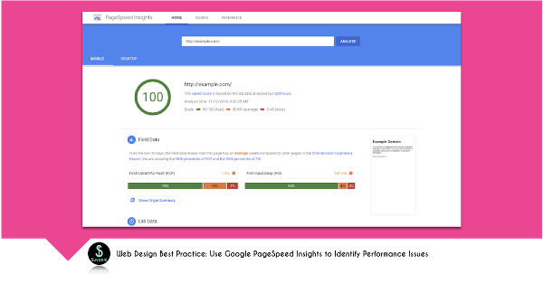
In terms of speed, there are a few things to consider. Google PageSpeed Insights is a great place to see how your website performs. There are several measurements that Google provides to test your page speed, because as they frame it “load is not a single moment in time – it’s an experience that no one metric can fully capture.”
Hence, Google PageSpeed Insights provides several data points to help you understand the load experience for both Mobile and Desktop. This tool provides an overall numerical grade as well as individual breakdowns for the 6 key metrics of web page speed. These are outlined below. The overall grade indicates whether your page is fast (90-100), average (50-89) or slow (0-49). Recommendations for improvements are also included.
Google PageSpeed Insights provides analysis of these primary metrics:
First Contentful Paint (FCP): This is the time at which the first image or text is “painted”. It measures the time from navigation to the first rendering of content. This is an important metric as it is also the reassurance to a visitor that the page is actually loading. The faster this happens, the more likely the visitor is to stay and wait for the full load.
First Meaningful Paint (FMP): This is an indication of the time it takes from navigation to when something perceived by the visitor as meaningful is visible on the page. It’s typically when the above-the-fold information and images have displayed and web fonts have loaded.
Speed Index: This is an indication of how quickly the contents of a page are visibly populated. Optimizing your pages to visually load faster is key to lowering your speed index (lower number is better here!). The two biggest ways to impact this are 1) optimizing your content efficiency and 2) optimizing the critical rendering path.
First CPU Idle: This metric (previously known as First Interactive) indicates the time it takes for a page to become minimally interactive. This means that most, but not all, of the elements on the screen are interactive and responsive to user input within a reasonable time.
Time to Interactive: This is the time it takes for the page to become fully interactive (all useful content is displayed, event handlers are registered for most visible elements and the page is responsive to user interactions within 50 milliseconds.
Estimated Input Latency: This measures the time it takes from user input to the responsiveness of the app. If an app takes longer than 100ms to respond, then visitors perceive that to be laggy. Note that this doesn’t measure your app’s response to a visitors input is visually complete. Therefore, if the time it takes to render a response visually is longer, then a visitor’s perception of the time it takes to respond could be even longer.
Investing in a good hosting plan is a smart web design best practice – always!
There are several steps you can take to optimize your pages for speed. Ensuring you are on a high quality server is a smart place to start. Websites hosted on shared servers often load much slower. It may be cheaper to get hosting on a shared server, but in the long run, this could have a huge negative impact on your page speed and ultimately your website visitors. One of our favorite hosting options is SiteGround!
Other areas to improve your speed and performance are ensuring your images are properly sized and optimized, efficiently encoding images, eliminating render-blocking resources, removing unused CSS, ensuring text remains visible during webfont load, serving static assets with an efficient cache policy, minimizing main-thread work, avoiding an excessive DOM size, avoiding enormous network payloads, reducing JavaScript execution time and minimizing critical request depth.
Besides Google Page Speed Insights, there are several other tools to help you measure your speed performance, including Pingdom and GTmetrix
#2 Web Design Best Practices & Trends: Mobile First + Responsive Design
It’s well known that responsive design is a must have website best practice. What is even more relevant in this day and age is taking a Mobile First approach. Mobile first is more than responsive design, though it certainly incorporates it. Mobile First is about creating web design around mobile experiences… first! In 2015, mobile searches overtook desktop searches, yet most websites still take a “Desktop First” approach to web design. It’s time to flip this around and put mobile experiences at the forefront. It’s how your customers and prospects are searching, discovering and purchasing via the web. Your website has to provide an optimized mobile experience if you want to provide the best experience to your visitors.
According to Google, “People are searching at the exact moment they need something and are looking for places that can meet their immediate need. In other words, when making these on-the-spot decisions, they are more loyal to their need than to any particular place.”
That is pretty powerful! By taking the time to truly understand your target audience and what they want to know, where they want to go, what they want to do and what they are looking to buy will help you prioritize these moments in a mobile-friendly way.
From optimizing your mobile menu and navigation (making it super simple to understand and find things on your website), to ensuring your tap targets are prominent and effective, to using contrasting colors and shapes to highlight what’s important, there are multiple ways to make mobile first web design work for you and your visitors.
Some great examples of mobile first web design:
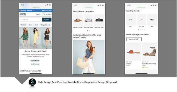
Zappos – Clean mobile first design using images and text cues to help visitors find exactly what they need in as few clicks as possible. The images and CTAs are appropriately sized for mobile devices without the need to pinch or scroll to view or select items.
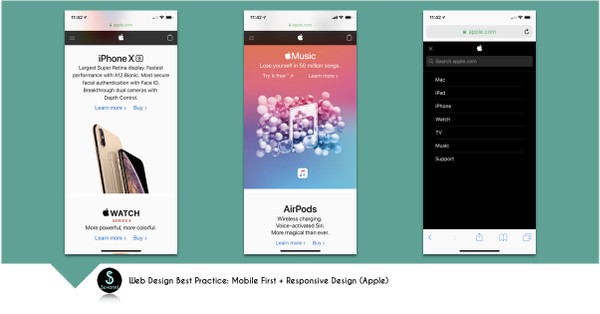
Apple – Clean mobile first design with a very simple menu. The first page is structured smartly with contrasting colors to highlight different products.
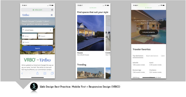
VRBO – Makes it very simple to start your search right away… simply and cleanly. The carousel of pictures is ideal for viewing on a mobile device. Search options include most relevant data for finding a vacation rentals.
#3 Web Design Best Practices & Trends: Minimalist Design
Clean and simple is the name of the game when it comes to web design best practices for 2019. Gone are the days of multiple side bars, tons of images, packing as much onto a page as digitally possible, etc. In today’s world, especially give the focus on mobile first web design, having a minimalistic design is essential for usability. With minimalistic design, you are providing the end user with an experience they really desire… a clean, distraction-free, easy to navigate site. It’s all about reducing clutter to focus on the most important elements of a page.
Minimalist Design does not necessarily mean a strictly black and white website, with no images or other creative elements. It’s more of a focus on clean lines, generous use of negative space (whether that be white or color), simple messaging, prominent typography, eye catching images, contrasting colors and designs, and super simple navigation to highlight what is really important. Reducing the number of elements on a page not only helps with minimizing distractions, but can also have a positive impact on your overall page speed as well. A definite win-win.
Minimalist website design as a best practice ensures you are providing your visitors with absolutely the right amount of content delivered in a very precise and poignant way.
Here are a few of our favorite websites that employ minimalist design:
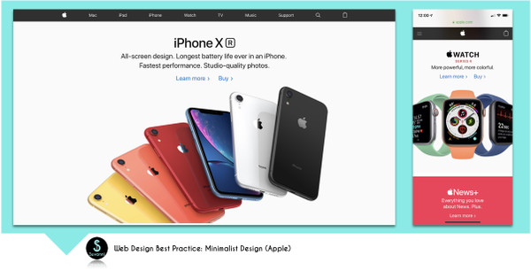
Apple – The focus is on helping you find what your are looking for right away. Simple text, bright images, ample white space and clear CTAs make this possible.
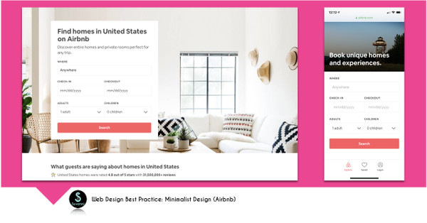
Airbnb – This site uses a grid structure to guide their visitors… the primary page invites visitors to take action and search – with a large appealing visual as a background image.
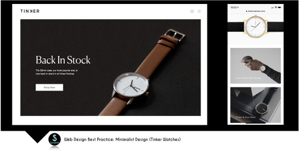
Tinker Watches – this design takes advantage of negative space and smart gridlines to showcase their offerings. Their menu is simple and their design is clean.
#4 Web Design Best Practices & Trends: Flat Hierarchy + Simple Navigation
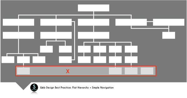
While simple navigation is an element of minimalist design, it’s an important feature to highlight on it’s own as well. Simple navigation as a website design best practice isn’t something new. Integrating a flat hierarchy is becoming more of the norm though. A flat hierarchy simply means that any information your visitors are seeking is accessible in as few clicks as possible. Ideally, all information on your website should be reached in 4 clicks or less from the Home page.
There are several ways to achieve a flat hierarchy and simple navigation for your website. First is the use of a parent-child structure that allows you to highlight the broadest categories of your website within the main navigation and details in the child pages. Visitors can easily identify what they are looking for and then drill down for more specific information quickly. The key is to ensure you have the right amount of information equally distributed on each of the child pages. Pages that are not linked to internally or that are more than 4 clicks from the Home page are at risk for not being crawled by search engines. This can lead to your pages not appearing in search.
Another way to ensure your navigation provides a seamless experience for the end user is by using Breadcrumbs. Breadcrumbs let visitors know where they are at on your website. They are important for both the end-user experience as well as for SEO. Breadcrumbs indicate to visitors and search engines how a page fits into the overall structure of your website. By using Breadcrumbs, you allow your visitors to easily navigate your website and find what they are looking for. Breadcrumbs cue search engines as to the structure of your site easily.
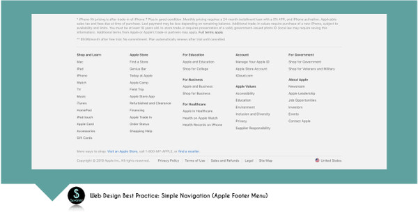
Other ways to positively impact the navigability of your website is to ensure your urls are reflective of the content (using actual words and phrases), contain the target keywords for your page, and aren’t excessively long. Primary navigation should use text based links that are simple, natural and make sense to your visitors. For example, Apple used their products as their primary navigation cues (Mac, iPad, iPhone, Watch, etc.) which allows visitors to quickly access the content they are seeking. Footer menus should replicate the primary main menu as well as include top links on the site. Notice the smart use of footer navigation on the Apple website.
Other website design best practices for simple navigation include using internal linking to help guide visitors along a path as well as increase page visibility and search engine crawling, making on-page navigation to both internal and external pages user-friendly (use of smart anchor text), and ensuring that every page of your website is linked to / from another page.
#5 Web Design Best Practices & Trends: Consistent Branding
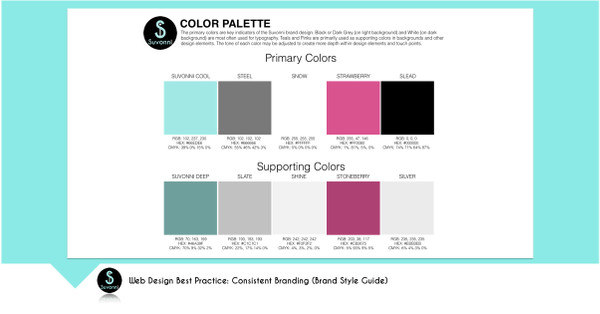
Branding is a key element in website design. As a best practice, it’s important to align your brand standards across all of your digital assets. Your website should reflect your brand in every way, including colors, typography, images, and the way you present yourself through content. This includes your brand voice, tone and personality.
Since your website is often the first impression that someone has of you, it needs to evoke credibility and consistency. Your visitors (customers, prospects, employees, investors, board members, partners, etc.) will often make a judgment about your company in as quickly as 6 seconds spent on your website. Therefore, your website needs to make a statement about you, your offerings and your value from the get-go.
Having a brand style guide is incredibly valuable for web design. It keeps your branding on point throughout your website. Whether you are updating your website internally or utilizing an agency like Suvonni, having a detailed style guide ensures that your branding is consistent across all your digital assets.
Canva has a really great article on how to create a visual style guide.
#6 Web Design Best Practices & Trends: Readability
Ok, this one might seem like a no-brainer… but the majority of websites today are laden with too much fluff, have challenging layouts and contain overly complex words and sentences. To ensure a great visitor experience, your website needs to have content that is legible (both visual and text based), readable and comprehendible (easy to understand).
Short concise information works best on websites. We live in a digital world in which the human attention span is becoming less than that of a goldfish! You have a short window to get your visitor to continue to engage on your site or click from it. According to research from Nielsen, 79% of users scan any new page they come across and only 16% read word by word. The importance of ensuring every piece of content on your website is valuable and engaging cannot be understated.
But, it is no small feat writing engaging copy for every page of your website. So, how can you design your website to make it more readable?
– Utilize strong, clear and large fonts for titles and section headers
– Use simple typography that is easy to read
– Design sections with bold and contrasting colors to make the stand out
– Employ generous use of white space to give content structure
– Keep it simple with only a few sentences per paragraph
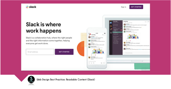
Slack is a great example of a website that makes it very easy for visitors to find what they are looking for. This site uses standard larger headers to break up sections and serves up content in short, concise snippets.
Don’t add content for the sake of adding content. Get to the point and give your visitors what they are looking for, simply and clearly. Keep your content simple and digestible. Use commonly referred to words, phrases and icons that your visitors may be familiar with. Use images and graphics to complement your content and help tell a story on your website.
Are you looking for help with your website design & development project? We can help! Reach out today to start the conversation about improving your web presence!
#7 Web Design Best Practices & Trends: Compelling Visuals
Visuals are a powerful element of any website. Don’t make the mistake of just throwing in random photos or overused stock images because you think you need them on your site. Using images that aren’t aligned with your content or that don’t convey a purpose just take up valuable space and weigh down your website. Instead, think about how visual elements on your website can help tell a story and truly complement your content.
Visuals can include images/photographs, videos, graphics, icons or hand-drawn art. Whatever the format, the key is to keep to your brand standards and style guide. Think about the colors, structure and style of the visuals you include on your website and make sure there is a common thread that ties them all together.
When relevant, use images with people. These type of images can be very powerful, especially when used strategically (people looking at content draws the visitors attention to that content). Again, avoid the use of stock photography when possible. Use images of real employees or customers to make it more genuine and authentic.
Here are some great examples visual storytelling:
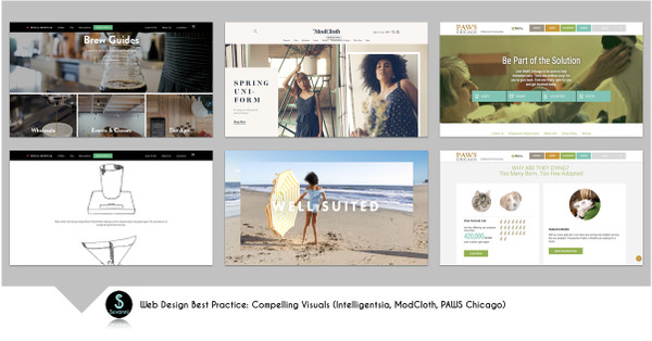
Intelligentsia – You are immediately transported into the coffee shop with imagery so vivid you can almost smell the coffee. They include hand drawn artwork to demonstrate the brewing process within their custom brew guides.
ModCloth – You get the vibe of ModCloth within the first few seconds of being on their website. They are fun and flirty and nostalgic. They use powerful video, gifs and images to showcase their products in a way that brings them to life.
PAWS Chicago – The use of powerful images to convey important information about pet adoption is woven throughout this website. They incorporate graphics and images that help to tell their story beautifully. And as you can see, they employ the use of a person strategically looking at their CTA to be part of the solution.
#8 Web Design Best Practices & Trends: Micro Animation
As the name implies, micro animations are small animations that enhance the user experience by providing depth and motion to a website. Small movement can provide a big impact in some cases. Some of the best use cases for micro animations are in navigation and helping to guide your website visitors along a certain path. A simple pulsating arrow can provide the right cue to give your visitors a sense of what to do next and where to go.
Micro animations can also be utilized for product demonstrations – giving your visitors a more holistic view of your offerings. This could be a simple 360 degree view of a product or a animation that shows how something looks in a different view (think different colors, shapes, sizes, etc.).
Here’s a cool use of micro animation on the Codeverse site… just enough to give the page some fluidity and a pop of fun, which compliments their brand and business perfectly!
The key to using micro animation is to keep it relevant and purposeful. Don’t add it just to have some movement on your website. Otherwise, it will just be seen as a distraction. Also, keep animations short. Don’t force your visitors to wait for a long animation to complete before they can do something.
#9 Web Design Best Practices & Trends: Discoverability / Search Engine Optimized (SEO)
You’ve gone through the painstaking effort of making your website the best it can be with great content, powerful images, consistent branding, simple navigation, minimalist layout, fast loading and a mobile first design… don’t let that go to waste by squandering your chance to be discovered by your target audience! SEO (Search Engine Optimization) is an absolute must-do web design best practice. It isn’t last on the list either! SEO should be woven into every element of your website design. If it’s an after-thought, then it isn’t authentic and that will be very evident.
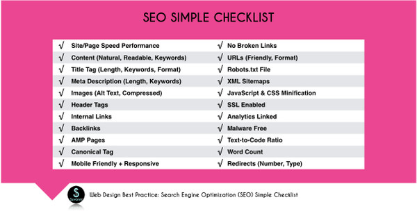
As you build (or re-build) your website, consider the purpose of each page. Identify your target keywords / keyphrase per page and ensure you are optimizing your content and images around this. A powerful title tag (that includes your keywords) along with your meta description (that also contains your keywords!) can be the make or break point in ranking. While several factors go into the ranking algorithm, these simple low-hanging fruit elements can have a very big impact.
SEO can be very complex, but there are tools to help you along the way. From the before-mentioned Google Page Speed Insights to SEO specific tools like SEOptimer, SiteChecker, Moz and Yoast.
Check out our Simple SEO Checklist below for some of the most common ways to optimize your website.
You can go deep on optimizing your site for search and discovery and many paid tools will help you track and analyze your progress. It’s an investment that can have a generous payoff though. Ranking on page 1 is a coveted position that can garner you a ton of traffic.
#10 Web Design Best Practices & Trends: Measurable (Track, Analyze & Optimize)
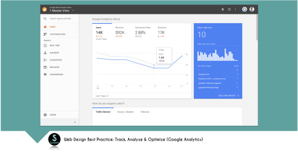
Don’t take a “set it and forget it” approach to your website. By tracking your website performance, you are able to analyze what is working and what isn’t… giving you the opportunity to optimize your site continuously. Look at your Google Analytics for insights as to what pages are the most popular, what entry points are most visitors finding you, where are you losing visitors (pages with a bounce rate), where referral traffic is coming from, how your promotions are performing, etc.
The key to analytics is determining what is most important to your organization for its continued success. You can certainly track, measure and analyze everything… but that may not be the best use of your time and resources. Create custom reports and KPI dashboards to focus your analysis on what is important to your business.
Keep your website up-to-date and fresh with new content often, especially if you have repeat visitors. They want a familiar, but different experience when they visit your website. It’s a perfect opportunity to introduce them to a new product or service, a new offering or element of your business or anything else they have yet to discover.
Summary
Take the time to think about how you can incorporate these web design best practices and trends into your own web presence. You should treat your website like any other marketing campaign – constantly looking at ways to improve it and optimize it for your audience. Need help with your website design? Reach out to us – we’d love to help with your web design project.

Darcy Schuller is the Chief Digital Marketing and Brand Strategist at Suvonni, an innovative boutique digital marketing agency based out of St Petersburg, FL. As a leader in the digital marketing space, Darcy is passionate about helping clients build stronger brands through elevated customer engagement, social media marketing, content marketing and dynamic web experiences. Darcy is a respected marketing thought leader, speaker and consultant.

